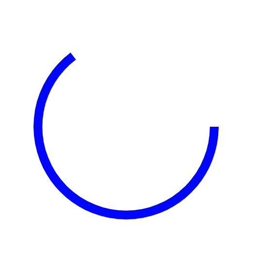
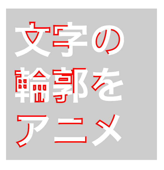
このアニメーションはCSSでSVGの属性を操作して、アニメーションを実装しています。
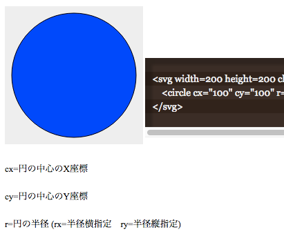
まず、SVGのcircleを用意します。
<svg xmlns="http://www.w3.org/2000/svg" viewBox="0 0 110 110" class="demo" >
    <circle cx="55" cy="55" r="50" class="demo" />
</svg>
    svg.demo{
        margin:20px;
        width: 200px;
        display:block;
        margin:40px;
    }
    circle.demo{
        fill:none;
        stroke:#00F;
        stroke-width:5px;
        stroke-dasharray: 314;
        animation: demo_kururi ease 5s infinite;
    }

    @keyframes demo_kururi {
        from {
            stroke-dashoffset: 314;
        }
        to {
            stroke-dashoffset: 0;
        }
    }
輪郭の設定をしている属性は以下の通り。
stroke-width:5px;
輪郭の太さ
stroke-dasharray: 314;
輪郭を点線にした時の長さ
stroke-dashoffset: 314;
輪郭を点線にした時の間隔(余白部分)の長さ
つまり、輪郭専用のアニメをしているのではなくて、点線のスタイルの変更を応用している感じです。
さらに314の数字の部分にはその円の円周を入れます。
このサンプルではわかりやすく半径を50にしているので「直径 x 3.14」の数値を使っています。