画像や文字がアニメーションすると、どうしても見てしまいます。
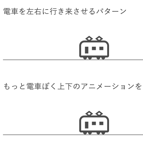
縦と横それぞれに揺らす表現は以前紹介しました。
縦と横の動きを混ぜることで、シャッフルするような表現ができます。
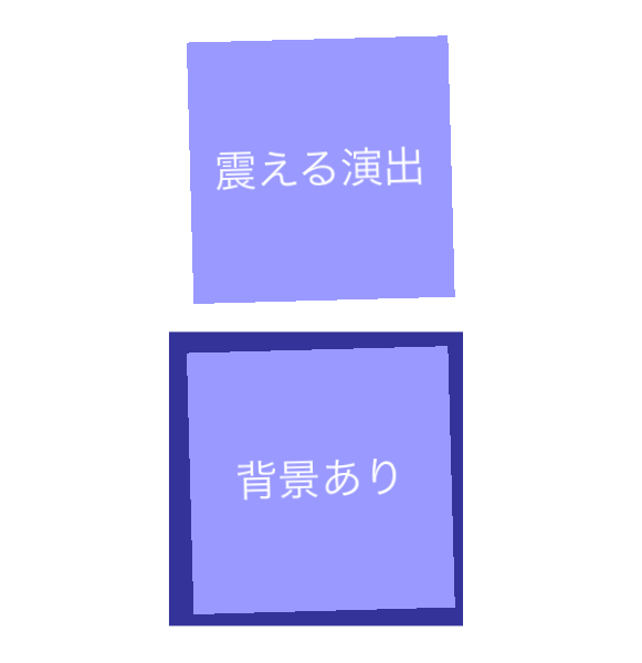
震える演出
背景あり
classを指定して、CSSのみのアニメーションです。
.demo_div{
	width: 100px;
	height:100px;
	animation: furu 2.2s infinite;
	background-color:#559;
	color:#FFF;
	text-align:center;
	line-height:100px;
}
@keyframes furu {
    0% {
        transform: translate(0px, 0px) rotateZ(0deg)
    }
    2% {
        transform: translate(2px, 2px) rotateZ(2deg)
    }
    4% {
        transform: translate(0px, 2px) rotateZ(0deg)
    }
    6% {
        transform: translate(2px, 0px) rotateZ(-2deg)
    }
    8% {
        transform: translate(0px, 0px) rotateZ(0deg)
    }
    10% {
        transform: translate(2px, 2px) rotateZ(2deg)
    }
    12% {
        transform: translate(0px, 0px) rotateZ(0deg)
    }
    14% {
        transform: translate(2px, 0px) rotateZ(-2deg)
    }
    16% {
        transform: translate(0px, 2px) rotateZ(0deg)
    }
    18% {
        transform: translate(0px, 0px) rotateZ(0deg)
    }
    100% {
        transform: translate(0px, 0px) rotateZ(0deg)
    }
}